
Free Size Multimedia Product
We can’t ignore the needs of creating static or motion visual product that suite every screen and platforms.
However, trying to satisfy every platform and screen would led the need us to resize and adjust the design, which is a time , resources consuming and the design wouldn’t be exact the same as you will need to do some alteration.
Imagine that we are able to identify the ultimate blue print for visual product which allows to create a single design that fit, every platform whatever that platform is, and all you need to do insert into software and the design fit the platform need and automatically cropped in the right angle.
Most designers, Animator and videography would re-create a design base on need each platform need but re-creating, reshooting is not visible all time because of many restriction and circumstances.
Base on this fact we need to rethink the way of production of the visual products rather than using think outside the box mind set, we need to introduce think inside the box. From that point view we can use Responsive web design (RWD) concept but to create visual product for different type platform rather think RWD for single platform.
That led to experimenting a blue print that created in 2019 which hold design for:
|
|
A single blue print use with mind set a single design for all platform, the design would be crop every single time into specific size.
The blueprint

The design

The result
Some of the result was published as real example and some of the result didn't go through to be seen by public as plan didn't goes as plan which specifically "email version" which could be result by re scale and that would resolve the issue.


Base on the result which was shared and not shared, it is possible to create single visual product to fit sizes if the blueprint was setup correctly, some specific platform such as email would need crop and rescale to fit the platform which is better result than restart or remodify the design from point zero.
Base on this attempt and other attempt the possibility of creating a visual product is possible especially for those design which with mind-set as inside box mentality than think outside the box.
The challenge would be for animated visual and videography more but that is not impossible for certain type of visual products, however the blueprint would be different and would be more 1:1 aspect ratio canvas to start the design with than for social media which can be done with 4:3 aspect ratio.

What is applicable to social media is also applicable to other concepts such as apply for headshot December 2021, if not earlier the idea of having 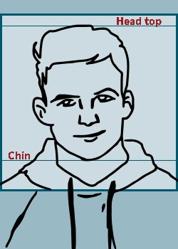 the best blueprint or formula to create template that would help to fit all the images into any system or digital media in snap that mean if the headshot in aspect ratio 5:7 with right positioning for head and chain in 1:1 frame inside the main canvas 5:7 means will be able to re purpose this image into different platforms that accept portrait, square images and potentially the 1:1 position will fit correctly to the circle frame.
The question are we able to think inside the box, is inside the box is the solution for optimise our time and resources or creativity killing and challenging. Is possible for product such as headshot the exact crisp resources as theory yes in practicality need more look into that matter but is good start to optimise the work flow and allows to be more efficient.