
Free Size Multimedia Product
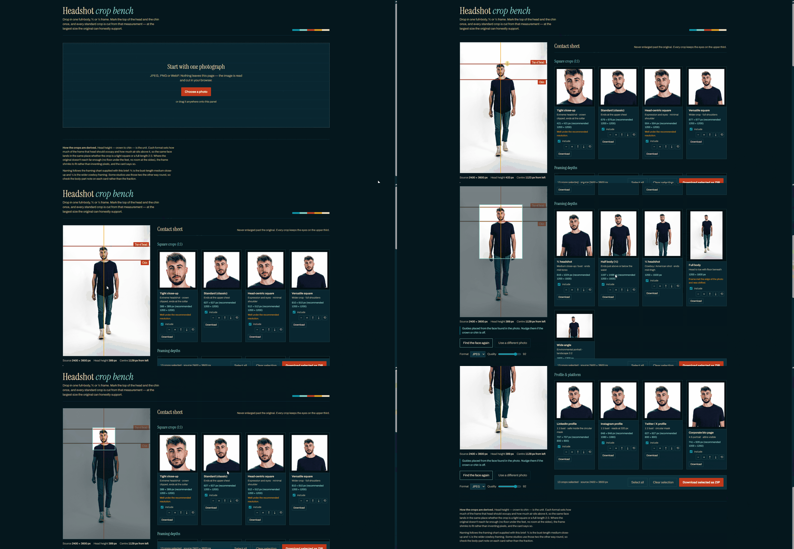
| Headshot Type | Aspect Ratio / Framing | Example |
|---|---|---|
| Tight & Standard Cuts | ||
| Extreme Close-Up | 1:1 |  |
| Standard Classic Headshot | 1:1 |  |
| Head-Centric Square | Square / Avatar Badge |  |
| Medium & Contextual Framing | ||
| Versatile Square & Bust Shot | 1:1 Headshot |  |
| Cowboy Shot / American Shot | 1/4 Crop | 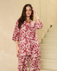 |
| Half Body Shot | 1/2 Crop | 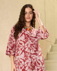 |
| Environmental Portrait | Full-Frame |  |
| Platform-Optimized Formats | ||
| Social Avatars | 1:1 Bust |  |
| Corporate Bio Portals | Responsive / Web Layout |  |
-
Read the Full Notebook Breakdown (Link to technical post)
-
Launch Headshot Crop Bench (Link to web app)
We cannot ignore the necessity of creating static and motion visual products that suit every screen and platform.
However, trying to satisfy every platform and layout forces us to constantly resize and adjust the design. This process is highly time and resource consuming. Furthermore, the final designs often lose consistency because of the required alterations.
Imagine if we could identify the ultimate blueprint for visual products, a single master design that fits any platform. All you would need to do is insert it into your software, and the design would automatically crop to the correct framing and fit the platform’s exact requirements.
The Problem with Traditional Re-creation
Most designers, animators, and videographers re-create assets from scratch based on each platform’s unique needs. However, re-creating or reshooting is not always feasible due to tight deadlines, limited budgets, and other restrictive circumstances.
Based on this reality, we must rethink how we produce visual products. Instead of relying on a “think outside the box” mindset, we need to introduce a “think inside the box” approach. From this perspective, we can borrow the concept of Responsive Web Design (RWD), but apply it to cross-platform visual media rather than a single website layout.
The Blueprint Experiment
This mindset led to a blueprint experiment I conducted in 2019. The goal was to create a single master design that could simultaneously support layouts for:
- Snapchat
- Instagram Stories
- Instagram posts
- Facebook posts
- Facebook Stories
- Twitter accounts
Using this blueprint, a single design is systematically cropped into specific dimensions for each platform.
- The Blueprint Preprocess:
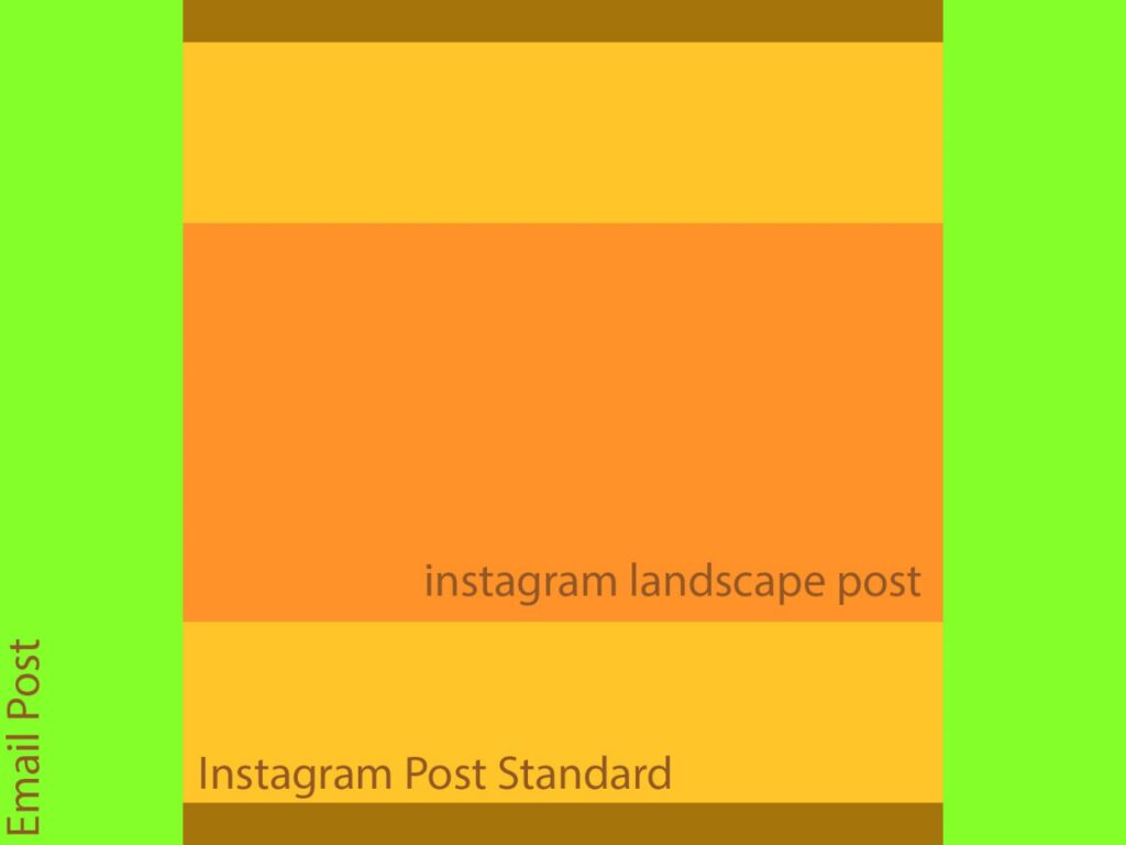
- The Master Blueprint:
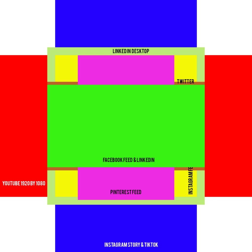
- The Design:

The Process Breakdown
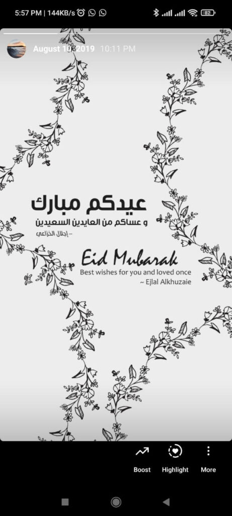


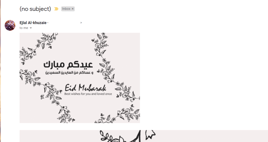
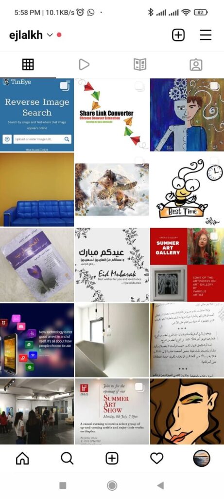

Some of the results were published as real-world examples. Others never made it to the public because things didn’t go exactly as planned—specifically the email version. However, simple scaling adjustments can easily resolve this layout issue.
Ultimately, these results prove that it is entirely possible to create a single visual product to fit multiple sizes, provided the blueprint is set up correctly from the start. Even if specific platforms like email require extra cropping and rescaling, it delivers a much better workflow than restarting or modifying a design from point zero.
Expanding the Concept: From Social Media to Headshots
While animation and videography present tougher challenges for this workflow, it is not impossible for certain types of visual products. The blueprint simply requires a different canvas. For instance, video might require starting with a 1:1 square canvas, whereas standard social media assets can be built on a 4:3 canvas.
What works for social media also applies to other visual concepts. For example, in December 2021, I explored applying this formula to professional headshots. The goal was to find a template or formula that could instantly fit a portrait into any digital system or media in a snap.
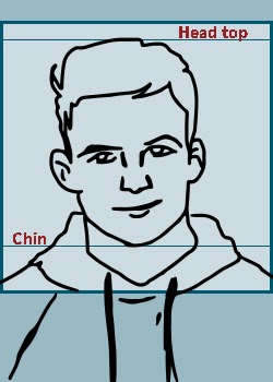
If a headshot is framed at a 5:7 aspect ratio, and the subject’s head and chin are positioned correctly within an internal 1:1 square safety guide, the image becomes instantly versatile. It can be repurposed for portrait layouts, square feeds, and the circular frames typically used for profile pictures.
Conclusion: Efficiency vs. Creativity
This leaves us with an important question: Are we ready to think inside the box? Is restriction the ultimate solution for optimizing our time and resources, or is it a barrier that kills creativity?
When it comes to products like professional headshots, obtaining exact, crisp resources works perfectly in theory. In practice, it requires careful execution. However, it remains an excellent starting point for optimizing workflows and maximizing production efficiency.